|
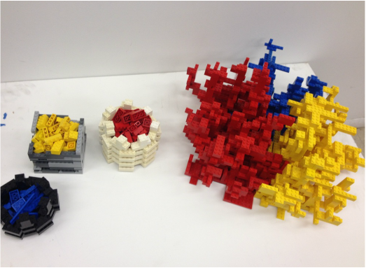
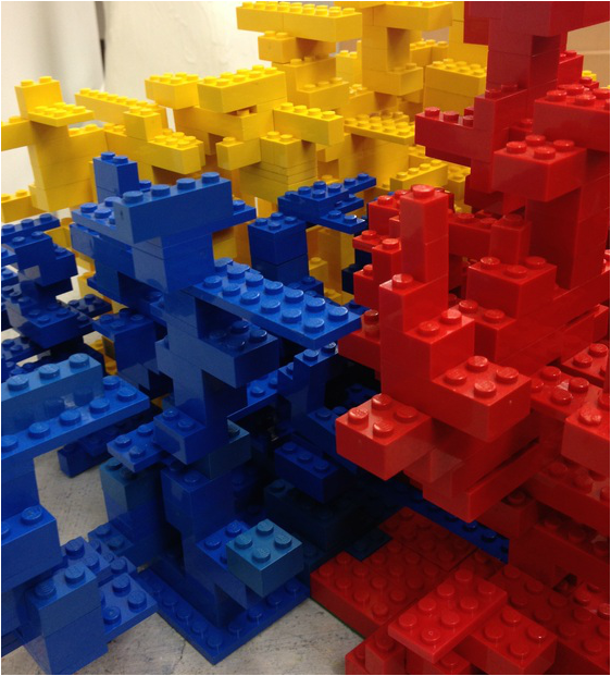
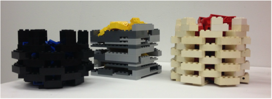
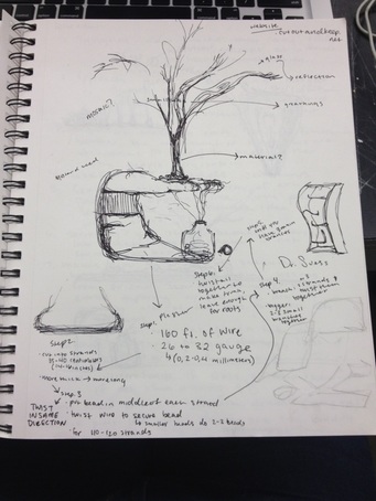
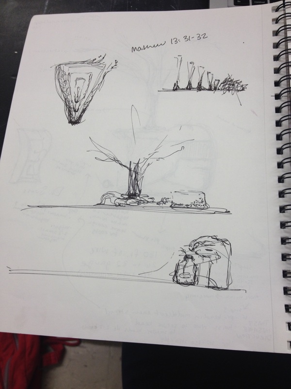
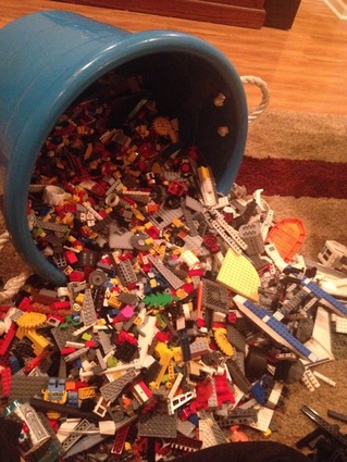
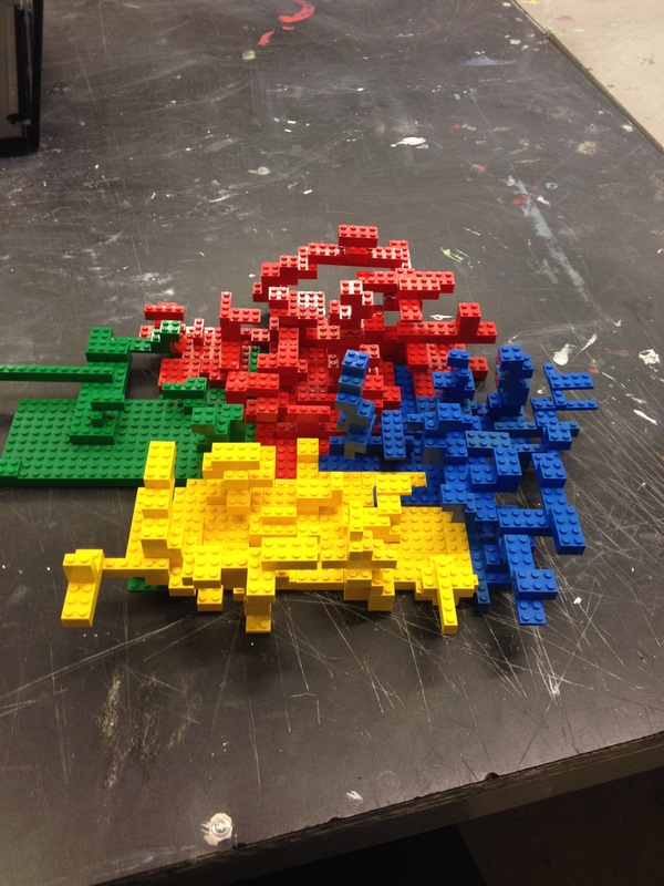
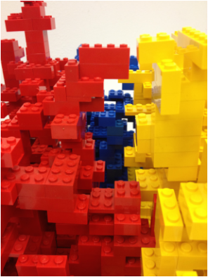
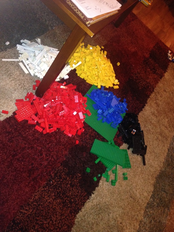
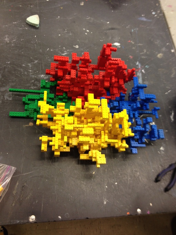
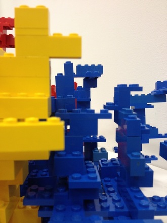
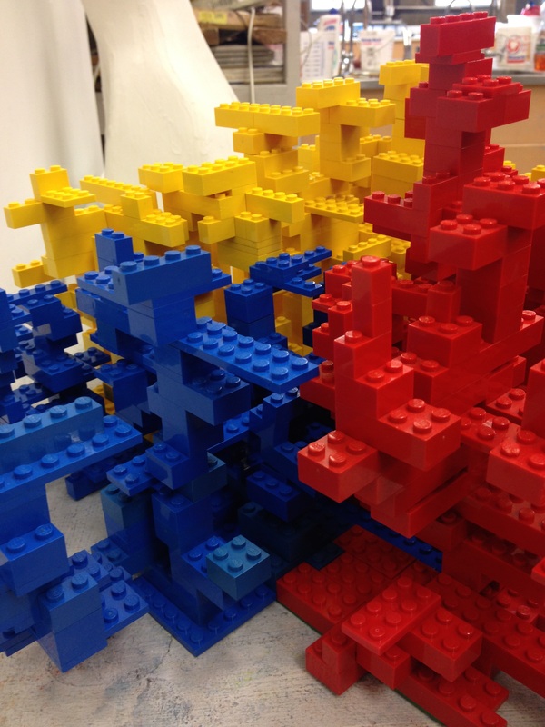
Final Project I believe in God and Christianity, however I also believe in evolution and the evolving of man and animals. Christianity was a very large part of my upbringing and as I have grown older I have discovered more about myself and my beliefs about the world than I ever thought I would. I appreciate my love for God and the values that he has given me to live by, but religion does not consume my life as it once did when I was young. In fifth grade I read the whole book of Mathew, I was very proud of myself; Mathew was not a short chapter in the bible. I of course thought it would look cool if I highlighted the shit out of the chapter and to write on sticky notes and in the margins, because I wanted to look cool; like I really studied this chapter of the bible, that I was really dedicated. I never fully intended to learn anything. I honestly just read it for show, but I learned probably one of the most important lessons in my life. In the New Testament, in the book of Mathew is my favorite quote/verse/parable. It is called the parable of the mustard seed, and it goes something like this: “The kingdom of heaven is like a mustard seed, which a man took and planted in his field. Though it is the smallest of all seeds, yet when it grows, it is the largest of garden plants and becomes a tree, so that the birds come and perch in its branches” Mathew 123:31-32. This was my favorite verse even before fully new what it meant. In eighth grade I started getting into the arts and because of my private school it was highly encouraged to make art about the bible or religious things. I immediately thought about my favorite bible verse. I thought to my eighth grade self, “A tree would be so beautiful to draw and it could come from a tiny person holding the little seeds!” I thought that the idea of something small turning and evolving into something big was so cool. I was never actually able to make that drawing and ever since then I have tried to find a unique was of portraying this parable in a way that was like my personality, appreciating the religion but not consumed by it. While searching for a worthy enough project for my final, I found my original sketch from eighth grade in an old sketchbook and I knew immediately knew that this was the time to make this meaning come to life. I thought for a long time about how I wanted to portrait it, still not wanting it to directly refer to the parable. I had a great idea, and then changed it, then the changed one Jeremy shot down and stomped on, then I thought some more. Through discussion with classmates, teachers and a long thought process I realized that all of my previous projects where straightforward. What’s there is there. People didn’t need to think to view my art pieces. I wanted this project more than that; make people think; to see something in a new way. Legos are a child’s toy, awful to step on, but so much fun to play with. I used Legos as my medium, because they are small. Just like the seed, they are tiny, just like children, atoms, molecules; all are tiny objects. But when molded together they grow and create big and monumental beings. My piece will be interactive because no matter what form it takes on, it creates something bigger than just one piece by itself. I left the color of the Legos the natural color because it shows the youthfulness of my idea and the innocence of the smaller objects. One could say this is a city made up of all different colors of people but forming a larger world. It could be a child’s creativity, so small and innocent but capable of bigger things. It could be the inner workings of an organism, complicated and unique. It will be left to the viewer to decide what object they want to see. The point of it is that even the biggest things, objects, or beings are created from something so small and yet are often dismissed. Don’t dismiss the small things; they will someday become the big things.
0 Comments
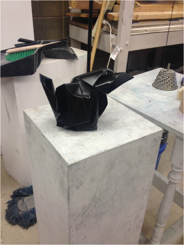
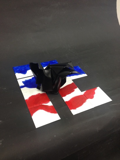
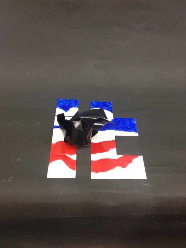
“Put a bird on it”. That was our prompt. Portlandia produced a video about putting birds on every object they could find and that automatically makes the “it” beautiful, and automatically makes the person who put the bird on it an amazing being and a genius for doing it. I think it makes it completely the opposite. I think instead the object becoming more beautiful it becomes a product of corporate America. Instead of making the person who did it a genius, it makes them a culprit in the corruption of innocent things. Birds, turtles, pigs, giraffes, ect. are all victims of this corruption. We change them, warp them, and abuse the natural beauty of the innocent creatures of this world. I’m not saying that producing art with any of these animals in it is bad. I’m saying that we as Americans, as people, become numb to who or what these animals actually are. Take Mickey Mouse for example. Little children grow up loving this iconic image, but they also grow up fearing mice. It doesn’t make sense we love the representation but hate the real thing. This piece is called the corruption of innocent things. The black bird represents the innocent things that the “it” meaning America or we as people abuses and corrupts. The bird is black because that color is associated with sorrow and morning, if these innocent beings could think and feel I believe that they would be sad about the way that they are represented in this world. The bird sits on its offender, us as people are represented in the word “it”. Starting now, lets start noticing things. Lets start teaching our children to love the object instead of the idea of one. Lets not be offenders. Stop the corruption of innocent things.
Classmate Interview
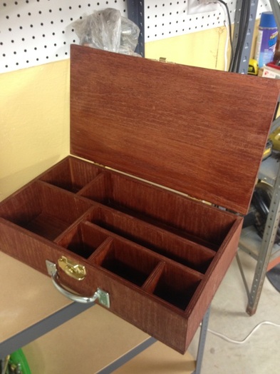
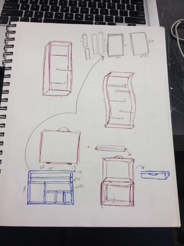
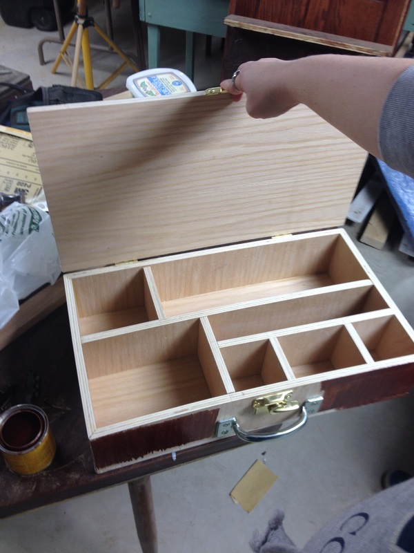
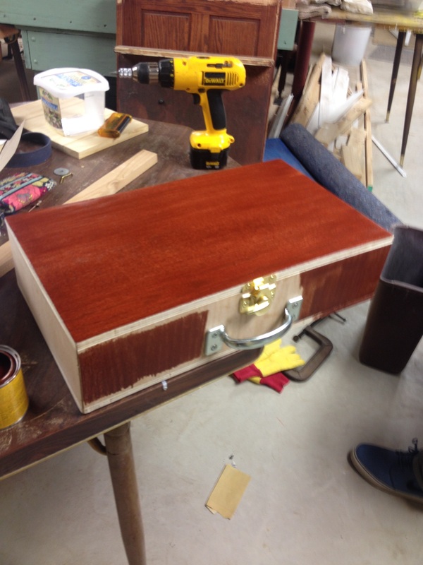
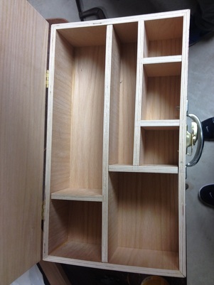
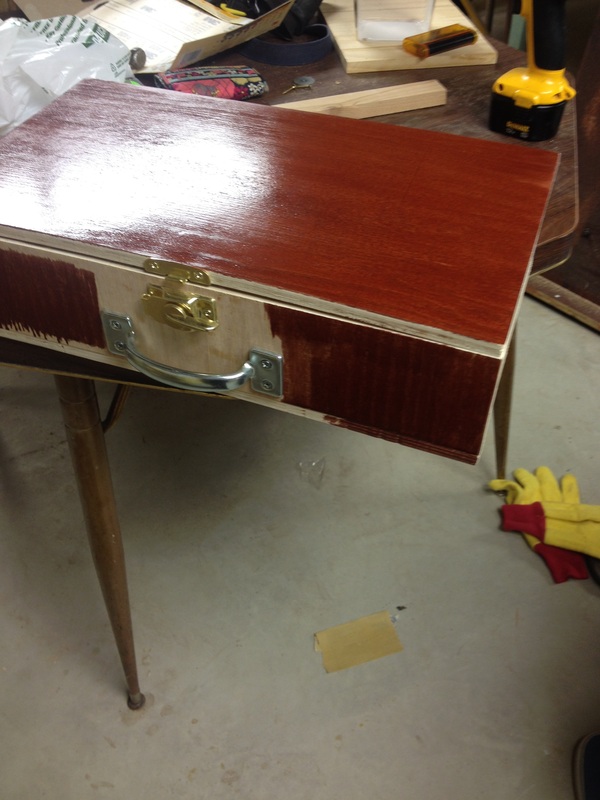
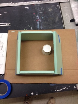
I had the pleasure of interviewing my classmate Rachel Olson. Rachel is a fellow art student of mine here at NIU, her hometown is Rockford and she loves it her at NIU. Below are some of the questions that I asked Rachel, and her responses to them. Enjoy! 1. What were your thoughts on the “Put a Bird on It” video made by Portlandia? “My initial reaction was: this is weird. As I thought about the video more in depth I started to realize an underlying theme of corniness, kind of an oddball video. But I did realize that the concept behind the piece was the overuse of a well known object just to make things ‘pretty’. As a Knitter I quite enjoy embellishing my creations with little additives like birds or snowflakes.” 2. What was your approach for this project? “I decided to go with a literal approach, I honestly am just going to put a bird on something. Because making scarves is such a joy to be and because sometimes I make them plain, with no embroideries, I decided to put a bird on one of my scarves.” 3. Do you think your scarf is an art form or more of a craft? “My scarfs are really more craft than an art, because they are much more functional and an ornament for the body. However, the ornament of the bird is not functional and the trendiness of things like birds will never go away because we as people buy into the trend.” 4. Where is that line separating craft and art? “I believe that craft is an art. I also believe that art is a personal opinion. Some people prefer fine arts and some people like making the everyday craft like decorative mason jars, or scarves and mittens.” 5. Why did you decide to become and artist? “Well art for me started as a hobby. Then I began taking lessons from one of my neighbors, because I was homeschooled. And I really looked forward to those lessons everyday. I started with drawing portraits and I fell in love with doing those, that’s when I knew that art could be an option for me.” 6. Did you ever have any other interests other than the arts? “Yes, up until about a year ago I was a physical therapy major. I didn’t think that the arts could actually be a major for me so I tried to pick something else. But I knew physical therapy wasn’t the right are for me so I came over to the arts.” 7. Where do you picture yourself in the future? “ My dream job would probably have to be as an illustrator. That is if I pass my portfolio review, if I can not pass that my backup plan is to become a drawing major.” 8. What is Art to you? “Art is happiness to me, It started off as something I just loved to do, and now I get to make it into my career. Art is emotions, happy or sad, that is emitted into a piece of art work.” As some of you may know, this is my first time working with almost all 3D materials. This wood project was definitely a test of my patient and willingness to try new things. I was very hesitant to start this project because the woodshop was somewhere I had never been, nor was it a place I would ever picture myself in. This project prompt was to think of some kind of life tool and make a home for it. As an artist I immediately thought of my paintbrushes and pencils. So I was determined to make a nice cozy little brief case for my art tools. Just as business people bring their files and paperwork home, I bring my sketchbooks and paints to and from the work place. One of the main reasons I designed the art box to look like a briefcase with all the different little compartments is that I have wanted this exact thing for a long time. I visited Paris with my best friend last year around this time and fell in love with a box like this in a small art shop on the Seine. Of course it was too expensive and I couldn’t afford it. So when this project was presented I figured that if I couldn’t find exactly what I was looking for at an affordable price, why not make my own exactly the way I want it. So the end product is something that is near and dear to my heart, because of how long I have wanted it. The plain wood seems so innocent to me and I cannot wait to start making it my own, and giving it its own personality. Stickers, paintings, dings, and dents you name it, by the end of next year I want this box to look like my art life. I want it to look like, if it could talk, it would tell many great stories of its life as one of my most prized possessions.
 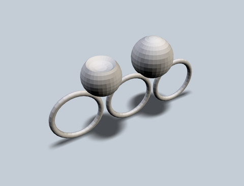 HALF FULL This ring was inspired by different peoples point of view. It sort of symbolizes the artistic version of is the glass half full or half empty. Or in this case it's a ball. You could say that the ball on the left is missing part of itself or you could argue that the shape with the dimple is the original design and the ball on the right has been added to. Wearing this piece of jewelry around all day would remind me to keep a positive outlook on life because we always have a choice to see either the negative or the positive. 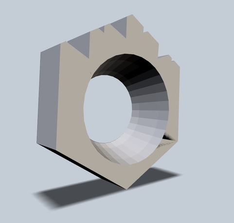 HOGWARTS This ring was designed to remind one of a castle, or in my specific design, Hogwarts. Harry Potter was such a big part of my childhood and still is to this day that I want to incorporate it into one of my pieces. I chose a ring because that is not something you would normally associate with Harry Potter, rings are for the Hobbit or Lord of the Rings. I didn't want my piece to be so simple and straightforward that the viewer had no free will to inturpret the piece. So this is the end result. The groves and cut outs at the top of the ring are meant to symbolize the Hogwarts castle and the hole for the ring is larger on one end than it is on the other, because just like in Harry Potter, not everything is as it appears to be. 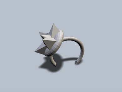 Edgy Youngster When I think of a headband, I think of little girls going through probably fourth or fifth grade. Girls this age, at least when I was young, competed on how cool or unique was their headband. I created this piece as sort of a defiance of this stereotype. This headband is an edgy version of the typical pink flower sparkle headband that so many of us had. Not every little girl wants to grow up to become a princess and to marry prince charming. So keep that in mind next time you try to conform your daughter, nice, or cousin into liking everything 'girly'. 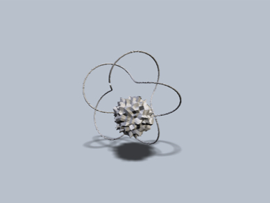 The Neutron Jimmy Neutron was a cartoon when I was little that I really didn’t care for all that much. My brother on the other hand loved this show. It was all about this boy who had a super human brain and was incredibly intelligent. As I got older I learned to appreciate the graphics and cartoon artistry that went into shows like that. So this pendant or necklace charm is to represent a neutron, neither positive, or negative. Not a proton or electron, just your plain Jane neutron. I think of the center at the hub of information and calculation and the multiple lines moving in and out of the center is you or the neuron trying to process the information it is being given. 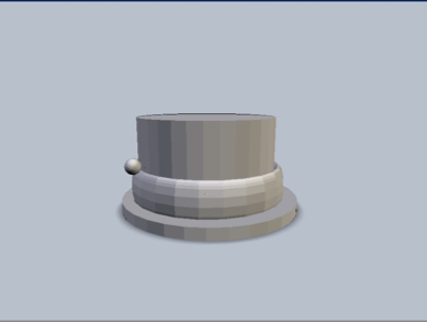 The Mad Hatter
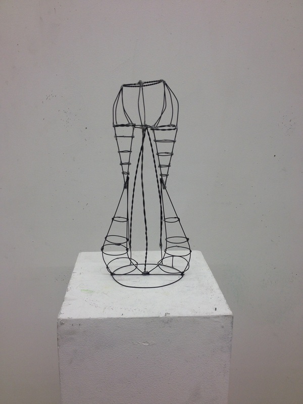
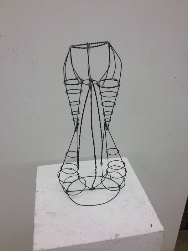
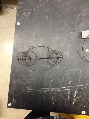
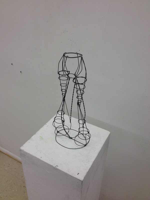
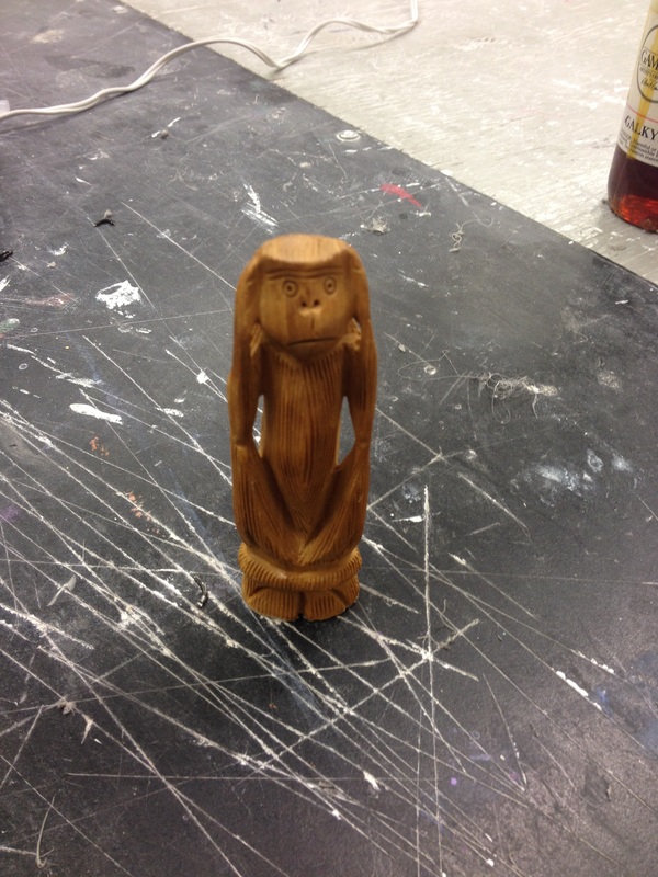
This hat is fashioned to imply the character that most are familiar with; the Mad Hatter. But it is not simply just a hat for him. I think everyone has a certain level of madness within themselves. Without this madness how could we ever form passion or emotion? We have to be mad about something in order to feel. Mad in love, or mad in hate; choose your poison. For this line assignment my piece is called ‘Hear no Evil Speak no Evil’. The objective of the project was to create the skeleton or inside form of an object using line, whether that is wire, match sticks, twigs, or any other form that would represent a line form. I chose my object because of the personal significance to me; I chose to represent a monkey. My sister brought this monkey home from India with her for me along with three other wooden monkeys. The three wooden statues are all a like other than the position of their hands. The three monkeys are Mizaru, covering his eyes, who sees no evil; Kikazaru, covering his ears, who hears no evil; and Iwazaru, covering his mouth, who speaks no evil. My wire sculpture replicates Kikazaru, who hears no evil. They represent the good in this world; exempt from the evils of this world, and rejecting the evils that everyday people let themselves be consumed with. This was my first time working with wire and I enjoyed the material, however I need to train my mind to start thinking in 3D. I had a good idea of what I wanted this sculpture to look like, and it did turn out that way. However the stages between figuring out what I wanted to look like and what is does look like was a bit of a struggle for me. Also trying to connect the wire I believe could have been done a little more gracefully than how I did it (lots of hot glue). Overall I really enjoyed working on this project and very proud of the end product.
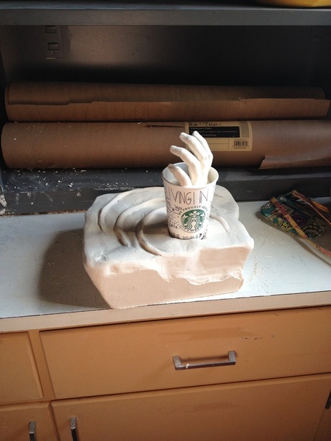
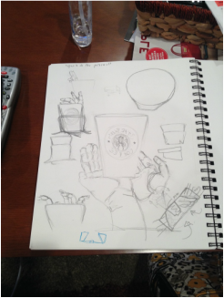
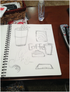
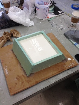
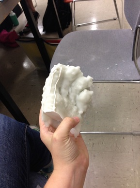
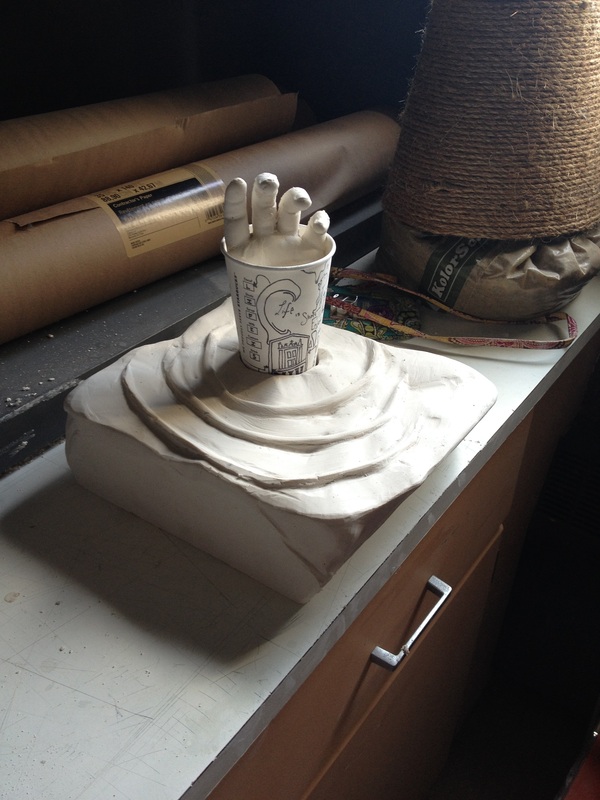
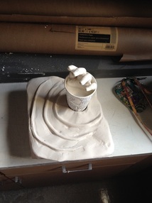
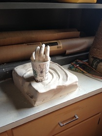
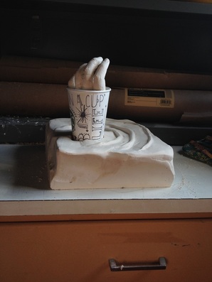
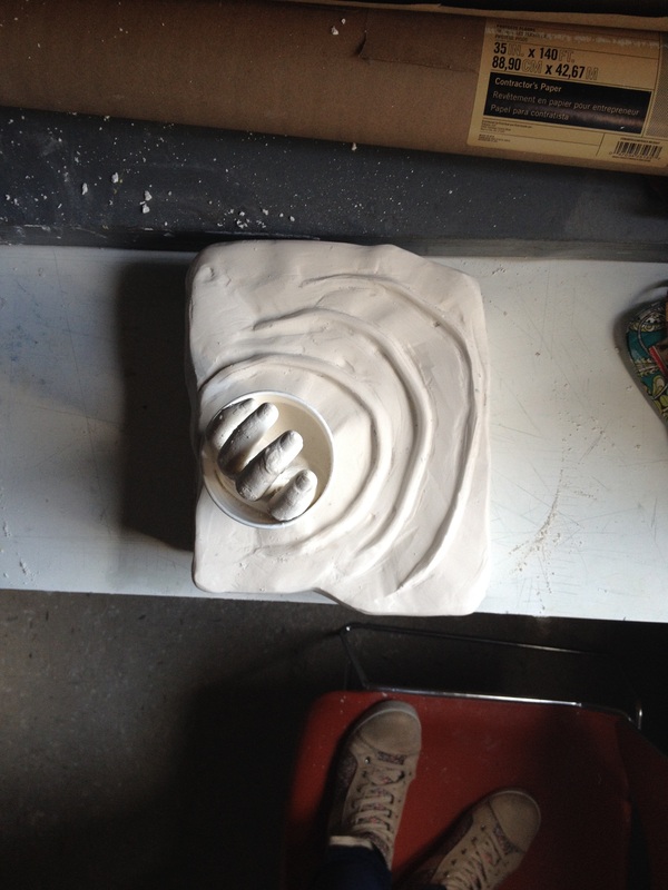
‘Living in a Cup’ is what I like to call it. This project of two elements coe existing with one another made me first think of myself and my journey here at NIU. How will I survive my freshman year of college? I asked myself this question everyday until that first week of class was over, after that I found the answer. Coffee; I knew I would make it through with a good head on my shoulders and a nice cup of joe. I love coffee now, I never used to until I realized the power of caffeine. I like the taste, the smell of warmth, the comfort. However, coffee and I have a love/hate relationship I survive with it, in it. But it owns me, my body knows when its time for another cup. My eyes droop, and the mind starts to wander without it. Something with that much control over my life scares me; I shouldn’t let something so materialistic control my life. So with these thoughts of coffee, control, and life I decided to make this project replicate these feelings. The coffee cup is a bit self-explanatory, and the cup is made to sit in the plaster mold. I created the base mold of this project to replicate ripples, like when you drop a rock in the ocean. The rock representing the coffee and the ripples being the effect the coffee and caffeine have in my life, whether good or bad. Inside the cup is me, or my hand more specifically, simultaneously living in and trying to get out of the cup showing my ever conflicting emotions about the affect coffee has on my life.
|
AuthorWrite something about yourself. No need to be fancy, just an overview. CategoriesArchives |
 RSS Feed
